[caption id="attachment_240” align="alignleft” width="157” caption="Leo Tolstoy”] [/caption]
Leo Tolstoy begins Anna Karenina with the famous lines: “All happy families are happy in the same way. All miserable families are miserable in their own way.”
I did my graduate thesis on the spatial relationship of stochastic variables. The stochastic variable which I found most interesting at the time was farmer corn yields. Since yields can’t go any lower than zero I had a preconceived notion that in bad years all farmer yields were bunched up down close to zero and on good years yields were very spread out with some farmers having average yields and some having nearly double their average yields. I was pretty surprised when I found that good year yield distributions look like this:
[caption id="attachment_243” align="alignnone” width="300” caption="IL Corn 2006”]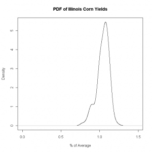 [/caption]
and bad years look like this:
[caption id="attachment_244” align="alignnone” width="300” caption="IL Corn 2002”]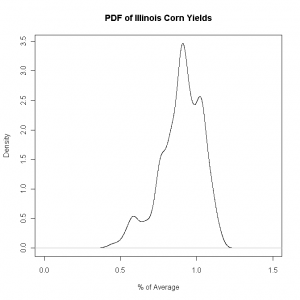 [/caption]
I was surprised by the notion that when yields are relatively low, like in 2002, the distribution has so much more dispersion. And in “good” years, like 2006, the distribution is rather compact. This pattern holds across other crops, other states, and different levels of aggregation/disaggregation.
So in happy years all farmers are happy together, but in miserable years each one in miserable in their own special way.
There are interesting spatial correlation impacts of this which are quite intuitive. If a good year is defined as ‘everyone does well’ then the spatial correlation is quite high since everyone is doing well. But bad years are defined by some doing ok, and some doing quite bad. This results in much lower spatial correlation.
Sooooo… BOTH the distribution shape AND the correlation matrix of crop yields must vary with yield level. That makes a proper stochastic model a bit tricky, no? Typically we assume the correlation matrix to be fixed and not a variable. That’s why it’s never boring to be a stochastic agricultural economist.
Footnote: The above graphs are PDFs based on county yields, not producer yields, but yields are fractal so the producer level yield distributions have a very similar shape. Data is from the National Agricultural Statistical Service (NASS). PDFs were done in R using the density function.