One of my favorite graphs of all time is this one from Kathy Sierra:
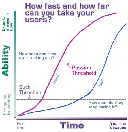
Figure 1: Kick Ass Threshold
I used that in my RStudio::conf(2019) presentation in Austin last week. I’m working on a related prez and I decided to create my own version of Kathy’s chart using R.
I played around with some simulations and found that the cumulative t and normal distributions gave good curves if I fiddled with their parameters. I wanted my lines a little bit jagged and not overly smooth so I opted to simulate 1000 points:
n <- 1000
df <- data.frame(curve = 'Learn Fast',
                 x = rt(n, 100))
df <- rbind(df, data.frame(curve = 'Struggle Long',
                           x = rnorm(n, 3, 2)))
Then it’s an exercise in building up all the ggplot options that I want:
ggplot(df, aes(x, color = curve)) +
  stat_ecdf(geom = "step", size = 2) +
  theme_classic(base_size = 18) +
  scale_colour_wsj("colors6") ->
  p
p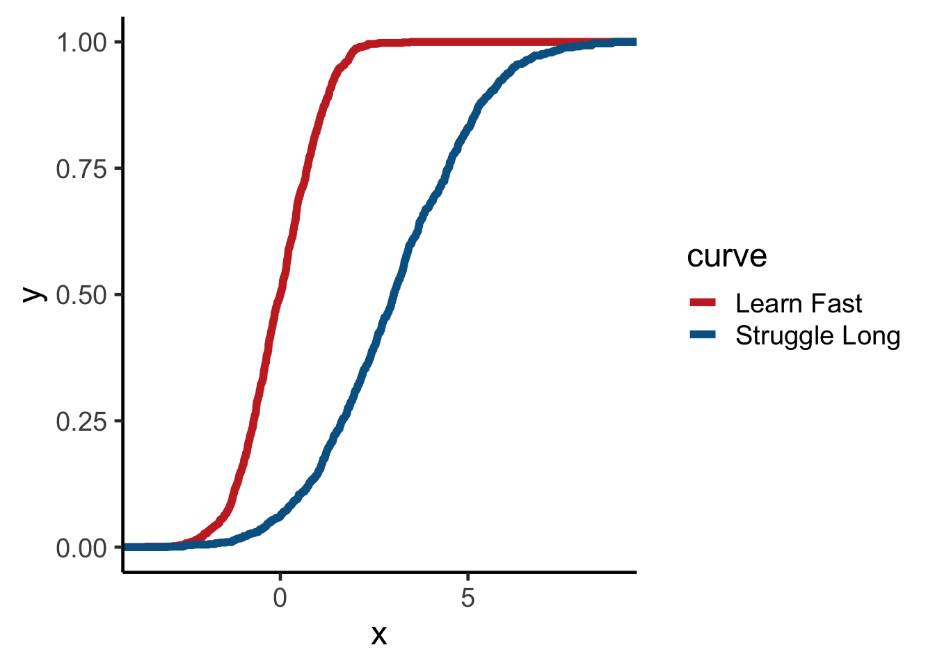
p +
  theme(
    axis.text.x = element_blank(),
    axis.ticks.x = element_blank(),
    axis.text.y = element_blank(),
    axis.ticks.y = element_blank()
  ) +
  theme(legend.position = c(0.75, 0.15)) +
  theme(legend.title = element_blank()) +
  labs(x = "Time", y = "Skill") ->
  p
p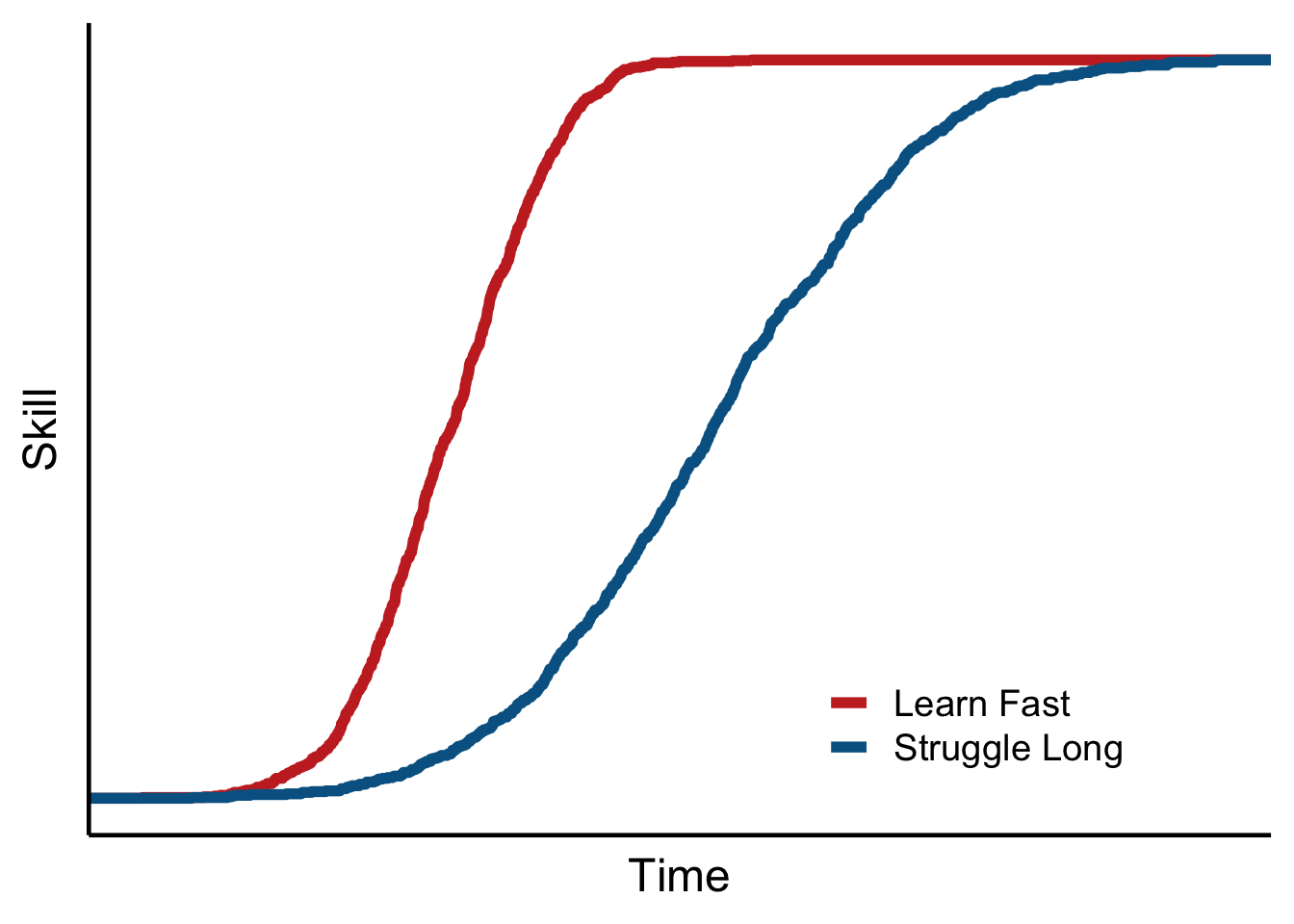
Now I want to add the horizontal lines and their labels:
p +
  geom_hline(yintercept = .25,
             color = "orangered",
             linetype = 2) +
  annotate(
    "text",
    x = -2.4,
    y = .29,
    label = "Suck Threshold",
    size = 5
  ) +
  geom_hline(yintercept = .75,
             color = "forestgreen",
             linetype = 2) +
  annotate(
    "text",
    x = -2. ,
    y = .79,
    label = "Kick Ass Threshold",
    size = 5
  )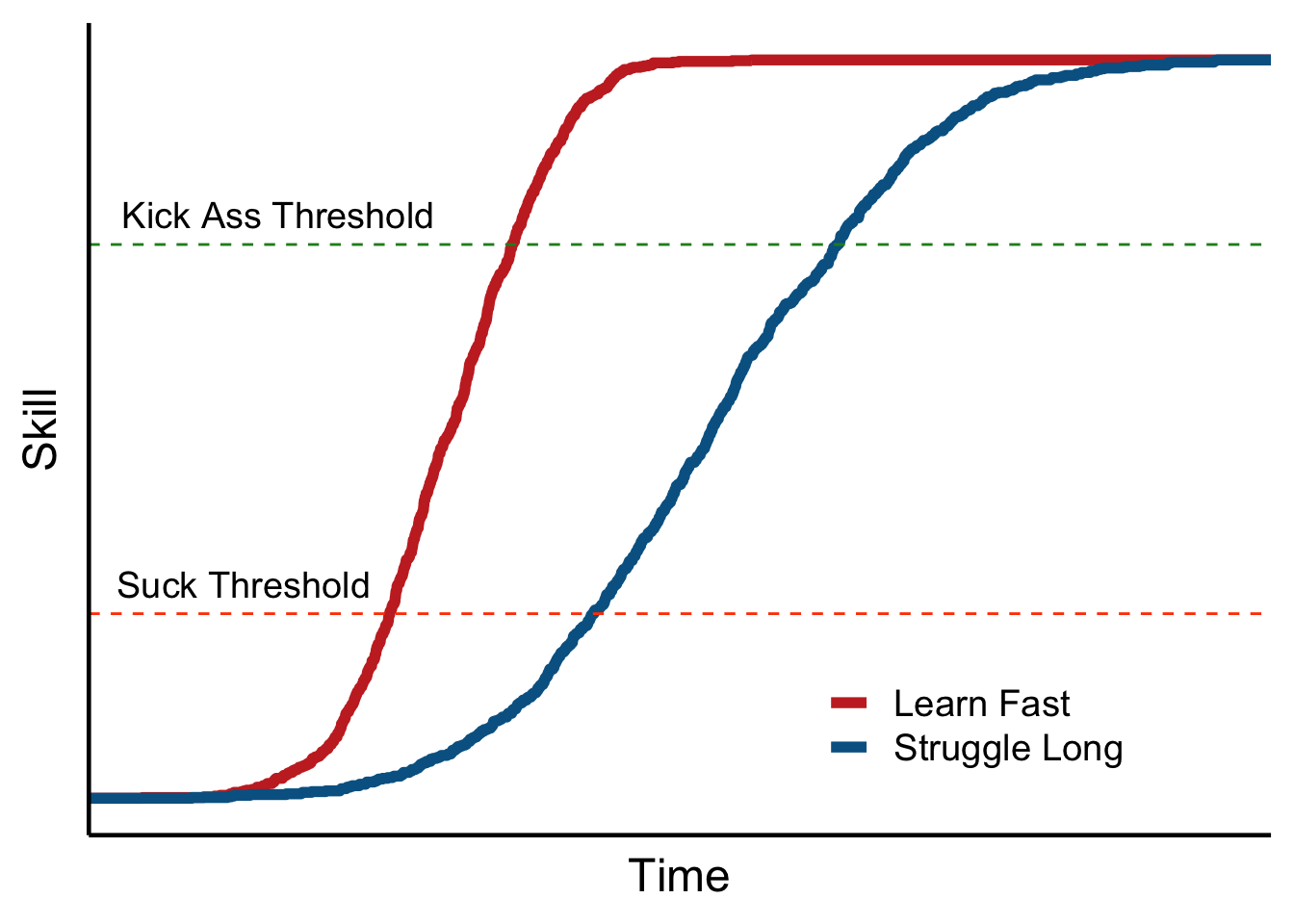
That looks pretty good. I think I like it!